Research & Discovery
User Research Findings:Through interviews with enterprise users, CTOs, and business analysts, I identified several critical pain points: Fragmented Tools: Users were juggling multiple platforms for different automation tasks
1. Steep Learning Curve: Existing AI tools required significant technical expertise
2. Poor Visibility: Users couldn't easily track agent performance or status across their organization
3. Collaboration Barriers: Teams struggled to share and collaborate on agent configurations
Competitive Analysis: I analyzed platforms like Zapier, Make.com, and custom AI solutions to understand: - How users navigate complex automation workflows
- Common patterns for agent/workflow management
- Information density vs. clarity trade-offs
- Onboarding approaches for technical products
Design Goals
- Unified Experience: Create a single platform where all agent types feel cohesive despite their different capabilities
- Progressive Disclosure: Show simple options upfront while making advanced features accessible when needed
- Clear Mental Models: Help users understand what each agent type does and when to use it
- Collaboration-First: Enable teams to share, version, and iterate on agents together
- Enterprise-Ready: Include robust permission, audit, and governance features
Design Process
Information Architecture
I restructured the navigation to create clear separation between agent types while maintaining discoverability:
Primary Navigation:
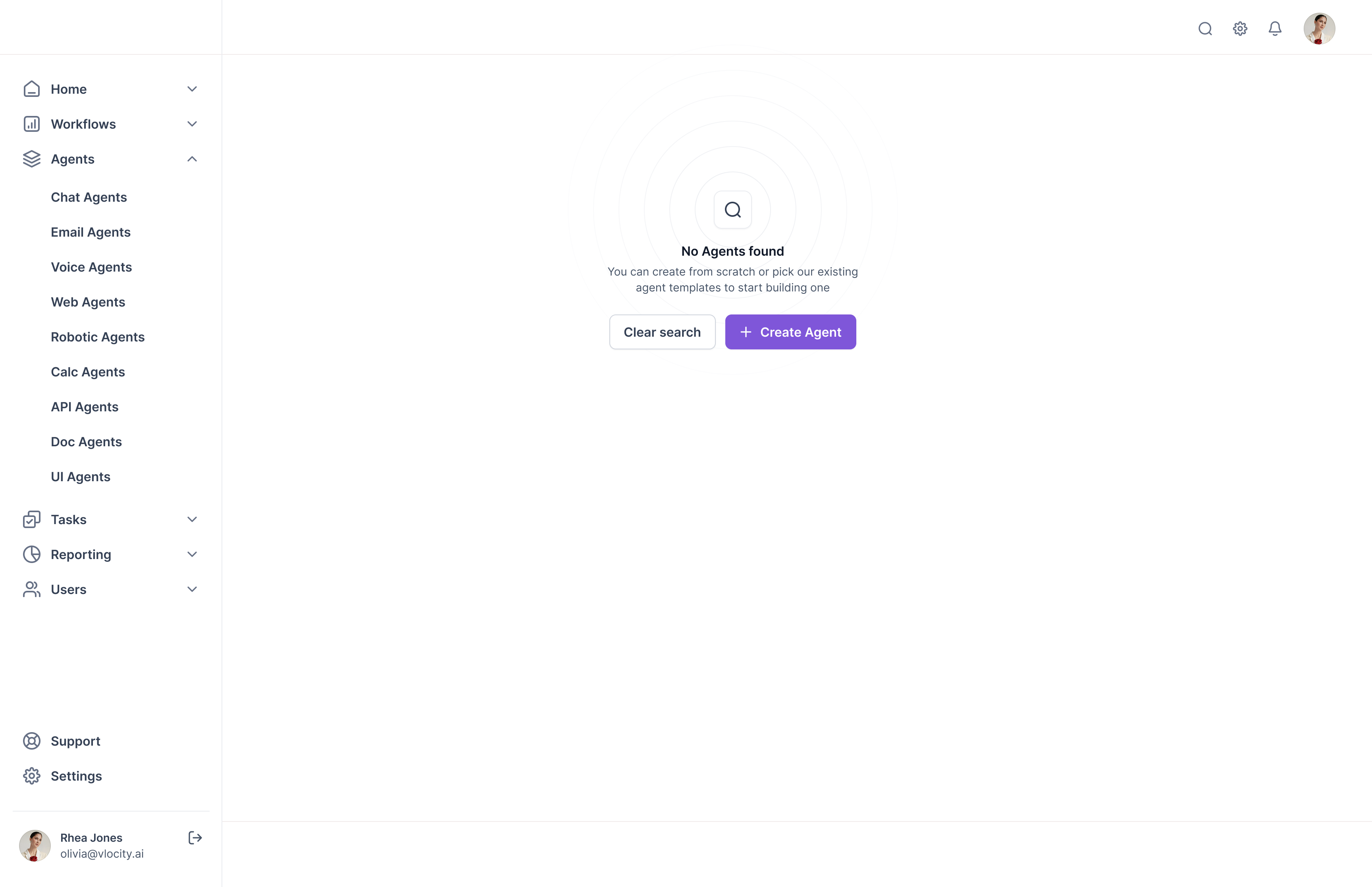
- Home (Dashboard), Workflows, Agents (expandable menu), Chat Agents, Email Agents, Voice Agents, Web Agents, Robotic Agents, Calc Agents, API Agents, Doc Agents, UI Agents, Tasks, Reporting, Users
This hierarchical structure allowed users to quickly find the agent type they needed while understanding the full breadth of capabilities available.
Agent List Views
For each agent type, I designed consistent list views that displayed:
- Project names with clear hierarchical sorting
- Creation dates for temporal context
- Status indicators (Active, Testing, Deactivated) with color coding
- Owner information with profile pictures for accountability
- Version numbers for tracking iterations
- Quick actions (Archive, Download)
Design Decision: I used a table layout rather than cards to maximize information density—critical for enterprise users managing dozens of agents.
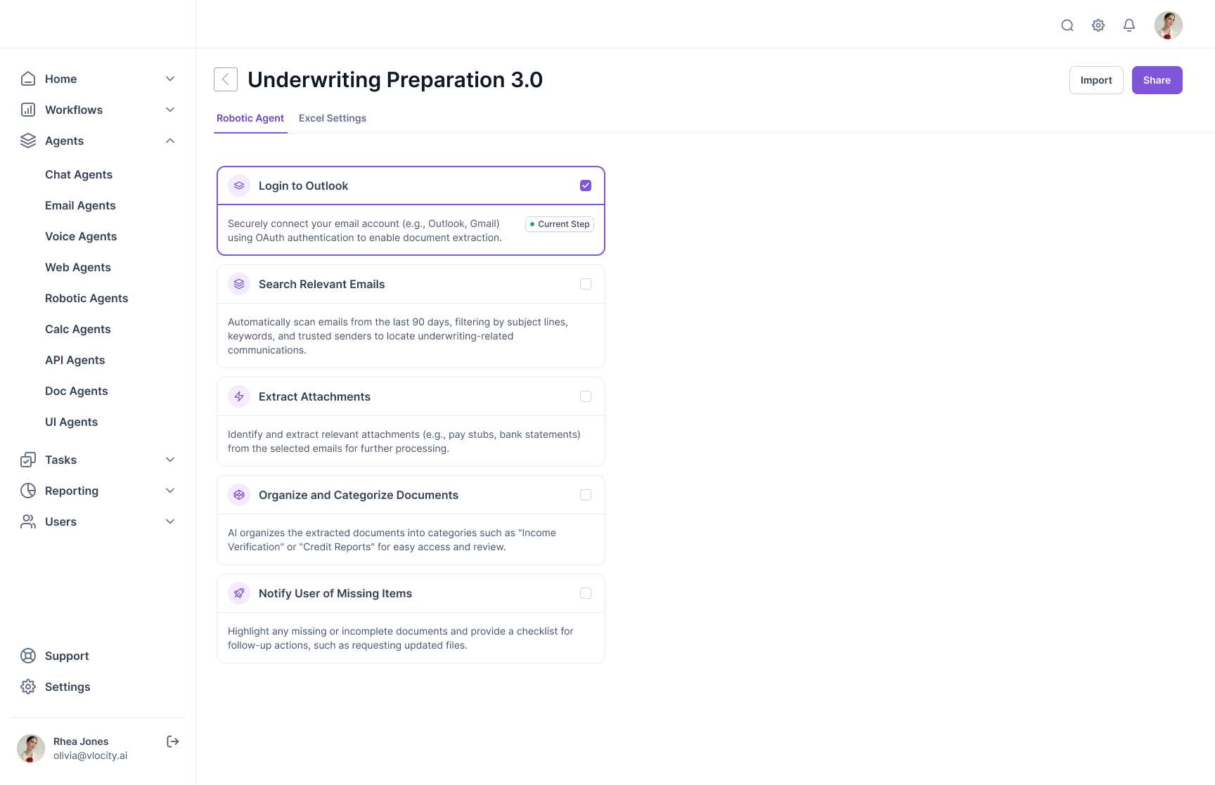
Agent Builder Interface
The builder interface was where complexity really lived. I broke it down into three clear tabs:
1. Builder TabThis is where users configure what the agent actually does. For example, in the Doc Agents:
- AI Model Selection: Dropdown to choose the LLM (e.g., "Simplify AI")
- Document Type: Auto-detect functionality with manual override
- Document Extract Table: Clear display of extracted fields with status indicators (Valid/Invalid) and values
- Source Document Viewer: Split-screen view showing the original document alongside extracted data
2. Agent Background TabConfiguration for agent behavior and integrations
3. Call Settings Tab (for Voice Agents)Voice-specific configurations like language, persona, and conversation flow
Key Interaction Pattern: I used a left-panel configuration approach with real-time preview on the right. This allowed users to see the impact of their changes immediately.